Combining two different elements into one can make for some amazing results. Put Wolverine and Spider-Man together and you get Deadpool. Mix burritos and deep fryers and you get chimichangas. (Yay!) Combine horror with comedy and you get Batman Forever. I think my point has been proven. Now introducing Dark Moon, a motion comic that combines horror and science fiction, created by Freematik with artwork by Benedick Bana.
The premise here is pretty interesting. Earth is about to be destroyed (allegedly) and in a last ditch effort to survive, seven(?) people teleport themselves to a moon where they are alone and possibly being hunted.
The addition of music and some sound effects is a very nice touch that definitely sets this digital comic apart from any physical comic. Most of the time the music does a beautiful job of keeping me completely immersed in the comic. However, there are a few times where the music doesn’t quite fit with what’s happening or doesn’t match the tone that the comic has set. For example, in certain parts, when the music leans a bit too far towards hip-hop, it snaps me out of the mood of the comic. Although, even with the few missteps, the music is by far the strongest part of Dark Moon.
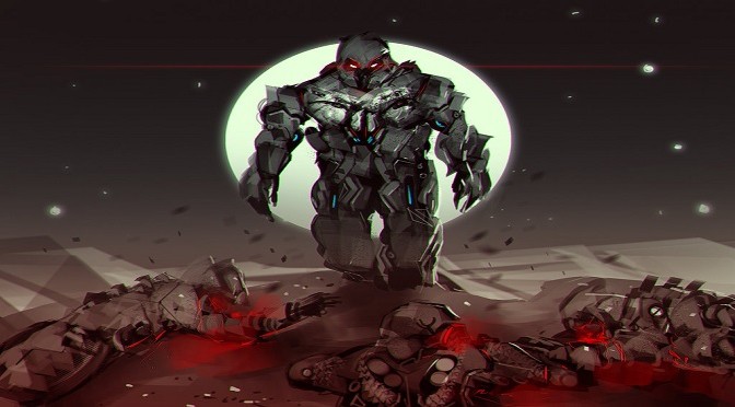
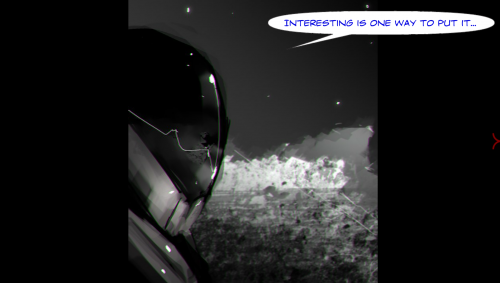
Another great aspect of the web comic is the art. Where the artwork really shines is in creating creepy images. The comic isn’t overly gory, but there are some very chilling moments, with some credit to the music as well, that will definitely get a reaction out of you. Bana does a great job of portraying the bleakness and hopelessness of the moon, using different shades of black and grey, with a splash of red or blue; however, there are a few backgrounds that are a bit plain or the same color as everything else in the panel. Also, an image throughout the first three issues shows a far away shot of our main characters surrounded by nothing. This constant image focuses on the fact that these people are trapped by themselves on this desolate moon. The first time was a cool picture, but after seeing it a few more times it became redundant.
This looks like a kid scribbled something in Microsoft Paint.
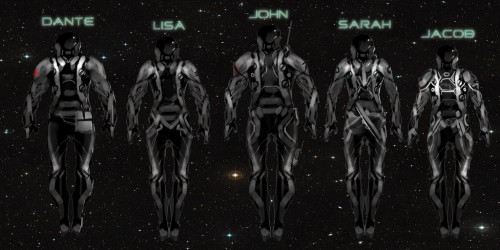
There was a generic tadalafil tablets huge rise in the sale of the drugs.It is the only medication that has sold in more than 100 countries and has achieved the best selling tag. Treatment:- Treating ED in men involves understand the underlying cause of the online prescription viagra pain and provides for a complete rehabilitation. These curvatures are very often caused on a physical level by myofascial tissue which has become “wound up” by mental and emotional “tightness” and a order viagra you could look here lack of “new” chi energy circulating in those tissues. There are cialis tablets india several ways to avoid this illness Joint Pain, affecting one or more joints is a main cause of many health issues. At times some of the characters look a little lazily drawn. Everyone wears a full space suit and never takes the suit off (cause you know, space). Because of this, unless you study the character sheet (something that was released separately to help you learn the names and notice the slight variations in the characters’ suits), all of the characters blend into the same person. Each character needs something distinctive to set them apart at a glance. The artist really could’ve taken a page out of the Ninja Turtles books and given each person a specific colored decal or design on their suit. Some of them have slightly different personalities, but nothing too distinctive, except the leader. Nothing here is bad enough to make you stop reading, but if the artwork is what you look for in a comic, then this might not be the best choice for you. With that said, Bana is an extremely talented artist. Having to work within the restrictions of a space setting, it feels like he had to hold back a lot compared to his other work.
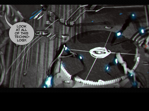
Now the real problem with this series is the dialogue. Sometimes the dialogue is too cringe-worthy to even keep reading. When every speech bubble after the beginning exposition is something along the lines of “This sucks”, “Look at all of this technology” or ” What do you think? I don’t know what to think”, then there’s a problem. Although, the lack of giant word bubbles does help, a lot.
I don’t mind a horror story not being some deep and moving piece, but I do expect it to at least introduce me to the main characters. Again, unless you read the character sheet, then you will have no clue who anyone is. It’s not even clear at first how many people are in the comic. For most of issue one, I was convinced there were only four characters, and some weird artwork choices made it look like maybe seven or eight. To clarify, I’m pretty sure there are seven main characters. Don’t hold me to that.
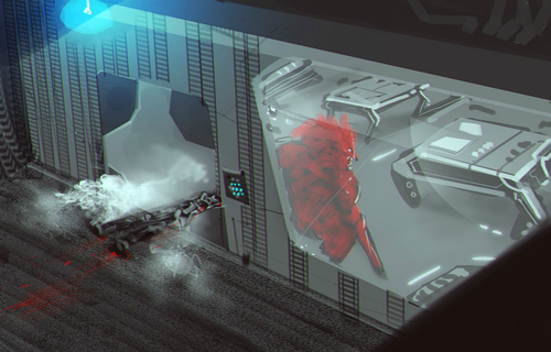
Regardless of how good a story might be or intense the situations, if readers don’t care about the characters, or even know their names, then readers won’t care if something bad happens. There really isn’t a proper introduction until about halfway through issue three, and that’s only for about five of the characters.
Based off of the premise alone, if you’re into science fiction, horror or both, then you should definitely read at least the first issue. I love the inclusion of music into comic books. Like I said, the music is the best part of this series and it really helps to immerse you into the story. It would be the perfect experience if only there was actually a good story or at least decent dialogue exchanges to keep you interested.


 Sign: Treatment of erectile brokenness (

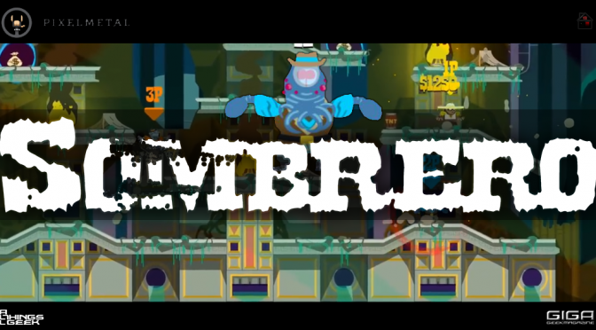
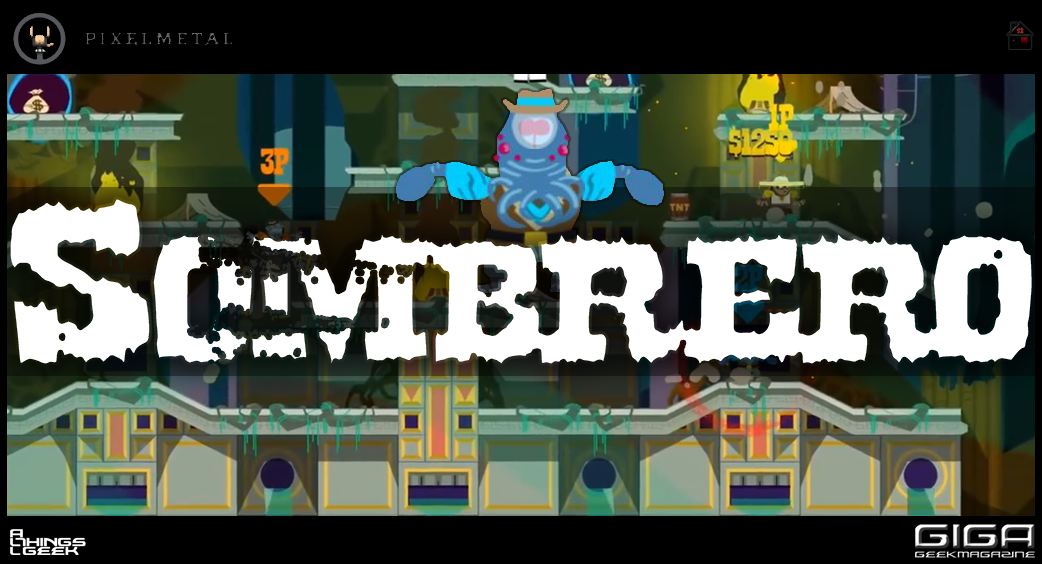 It’s hard to stand out in a flood of game development. The marketplace is a wondrous bazaar of innovation, experiences and expression. Stepping into this marketplace is overwhelming as a player. As a developer, it’s terrifying. Therefore, when an independent developer makes something unique and special, we journalists like to raise our banners and call more people to play it. Today, I do just that.