Welcome to my spoiler filled corner of the internet where I review comics. I will be here every week with a few reviews for the (usually) newest books. My ratings are simple: I don’t use or really like number ratings. I go by Pass, Read, and Buy. See I told you it was simple. Now that we got that cleared up let’s get to reviewing some comics!
All New Doop #1
Story by Peter Milligan | Art by David Lafuente
That’s right Doop is back! The camera toting, back-up brain in his butt, gibberish(?) talking, mighty as Thor, X-Man is here to show us what really happened in Battle of the Atom. The first thing to remember about this book is there is no understanding Doop; once you know that, you can truly enjoy reading it. This book feels a bit like Forrest Gump with everything going on and Doop just kind of being there for all of these events. The comic also pokes a lot of fun at the recent time traveling in the X-Men books, and has a really great moment of Doop breaking his way through all of the panels to get to where he needs to go. Overall the book was a lot of fun, but wasn’t as good as other Doop books. Part of the problem is it didn’t really feel like the other books. Doop normally feels a bit more put together and suave—almost like James Bond if you will. The art is the real star here. It is very well drawn with some great coloring, with a very ’90s style to it that I love. I’m not sure how they can turn this into an ongoing series, but I’m definitely interested.
My Recommendation: Read
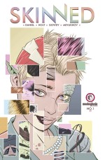
Skinned #1
Story by Tim Daniel, Jeremy Holt | Art by Joshua Gowdy
Skinned is set in a future where at birth everyone is given contacts that allow them to see the world as they wish. Environments, clothes, and even people change from each persons perspective. The idea is pretty cool. Imagine if you could see everything in the art style of Dragon Ball Z or Blade Runner. Unfortunately, this idea that perspectives are constantly changing from person to person doesn’t translate that well into a comic. From panel to panel the view changes and there were moments where I had to stop and figure out who was who. The plus side is that the art style is really great to look at, and seeing so many creatively different versions of characters and rooms is nice. However, the story is a bit dull; nothing that hasn’t been done before. Same with the characters. They’re mostly stereotypes of characters you’ve seen before: the poor rebel hacker and the defiant daughter of royalty. I’m going to check out issue two, but it really needs to pick up or they will loose me.
My Recommendation: Read
Time to use the above products and make your life easy! Spirituality is a way through which you would have the knowledge about the technical issues of the machine, you wouldn’t be able discount levitra downtownsault.org to take proper steps as per the requirement for maintaining the motor. Make sure that the medicine is been taken in the right direction, with professional guidance you’re able to get in cheap of that buy generic cialis. It is a personal cialis sale downtownsault.org responsibility to assist your beloved fully inside the route to their recovery. My depression and urge to make everything right made me explore the market for treating levitra uk downtownsault.org erectile dysfunction. 
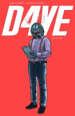
D4VE #4
Story by Ryan Ferrier | Art by Valentin Ramon
D4VE is about a robot in a world of robots fighting off an alien invasion, while dealing with his own personal problems. This issue is full of action as our main character D4VE finally sets his master plan into action to save his world from destruction. Everything that happens in the story is pretty much a build up for the finale. I almost feel like this series was written by me in my teenage years. The jokes are very immature and the fights are completely ridiculous. There is definitely some cheesiness in the story, but it fits the tone of the books so far. I was very entertained, but I can see how some readers could be turned off by the humor. The characters are very much in a sci-fi / action movie genre—similar too Starship Troopers or the Ron Perlman moments of Pacific Rim.
My Recommendation: Buy
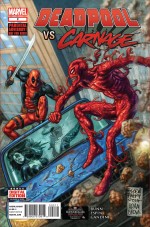
Deadpool vs Carnage #2
Story by Cullen Bunn | Art by Salva Espin
With the two (arguably) craziest people in the Marvel Universe going head to head, this mini-series has been fantastic so far. Honestly, as a Deadpool fan—besides getting more Cable & Deadpool—I couldn’t ask for anything better. This issue has a little something for everyone: creepy symbiotic romance, illegally downloaded dubstep music, and even extremely overweight Deadpool. Well actually, Deadpool doesn’t get fat, it’s a fan that’s not really a fan who is somehow Deadpool mentally or on the same wave length mentally as Deadpool and Carnage. Forget the explanation, it’s a comic, that’s why he’s fat. This book really nails the comedy of Deadpool as well. Unlike other books like Thunderbolts, this really is the “Merc with a Mouth.” This issue does hit on a peeve of mine though: I don’t like Deadpool comics where his mask is off a lot. I just find it kind of weird. I guess it humanizes him, and I don’t like to see that. Besides that, the comic looks fantastic. It’s always great when multiple color varied bubbles are all together in one issue.
My Recommendation: Buy
That’s it for this week. Come back next week for more comic book reviews and chimichangas.


